Buildings possess energy that can at times elevate or depress the people who view and inhabit them. Like other art, architecture can both be in and rise above its times. Talking about the stock market crash of 1929 and the Great Depression, bandleader and jazz singer Cab Calloway once said that people really needed entertainment when the bottom fell out of the economy. “It’s one way to get out of the gloom,” he said, as the book New York Deco quotes Calloway as observing. The same could also be said of what people saw in the Art Deco buildings of the late 1920s and 1930s.
Art Deco’s energy, artistic beauty, pizzazz, and ebullience are striking, given the boom-to-bust economic climate that the era spanned. Art Deco was enthralled with technology, progress, machinery, inventions, and worldwide travel, which its designers captured in decorative elements such as soaring airplanes, streamlined automobiles, and luxury liners. Its symbols, ornamentation, and shapes spoke that language in the bubbly times before the market crash and even after the Great Depression battered the economy as well as the living situations of millions.
Yet, Art Deco drew from the history and myth of yesterday as well as looked forward, which is part of what makes it fascinating. The approach newly imagined forms from the past and borrowed from visions of the future, blended into a wholly unique look. As historian Richard Striner, who has focused extensively on Art Deco in a number of books, has observed, Art Deco inhabited a middle range between antagonistic design ideologies – the militant traditionalists and the radical modernists, who waged an “architecture war” during the 1920s and 1930s.
Some sought solidity in the forms of the past, while others focused on the ultra-modern. Art Deco did both. The style was streamlined, eclectic, and flamboyant, signaling the modern, while also hearkening to traditional symmetry and hierarchy. Its creations juxtaposed ancient imagery with futuristic visions, and in doing so, they encapsulated the tension and anxiety of the era, according to Striner.
You can find this blend of ancient meanings and figures with modern symbolism in the rich, finely crafted architectural panels and shields of Art Deco buildings, both exterior and interior. Each has its own story, both in content and form.
Here’s a look at two illustrative panels:
The Koppers Building, Pittsburgh
When Koppers started construction on its massive, exquisitely appointed headquarters in 1927, it had a booming business as a maker of coke ovens for the steel industry, according to a 2004 Pittsburgh Post-Gazette article on the tower’s 75th anniversary. German engineer Heinrich Koppers established the company headquarters in Pittsburgh in 1914. He had devised a more efficient coke oven that would recover byproducts in the cooking of coal to convert it into fuel for steelmakers’ blast furnaces. The company completed the 34-story skyscraper, set in downtown Pittsburgh at the corner of Grant Street and Seventh Avenue, in March, 1929.
The structure reflects both the traditional and modern in important ways. Although its chateau roof took a page from the earliest metal-frame skyscrapers in the 19th century, it typified the first contemporary Art Deco structures of the 1920s with a strong vertical character of stepped setbacks, smooth surface, and geometric ornament. The architects, Graham, Anderson, Probst, and White created a structure that embraced modern styling and reflected the company’s and Pittsburgh’s importance at the center of a flourishing steel industry.
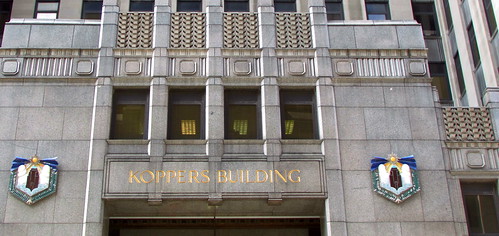
The shields flank the Seventh Avenue entrance.
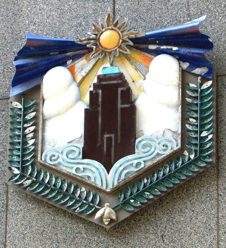
A close-up of one of the two panels
If Art Deco panels often tell a story at a glance, then the metalwork shields at the Koppers entrance portray a company’s self-image as a shining beacon of industry. The vividly colored panels show a rendering of the Koppers Building in miniature, surrounded by delicate ferns and scrollwork, with a bright yellow sun above the structure. It shows the eye-catching green copper roof just underneath the sunlight rays.
Today, Koppers is a multinational industrial corporation. The ownership of the 86-year-old skyscraper has changed hands several times, and Koppers no longer owns it. The company is one of dozens of building tenants, maintaining its global headquarters in Pittsburgh. The Art Deco panels remain, objects both of beauty and history.
29 Broadway, New York
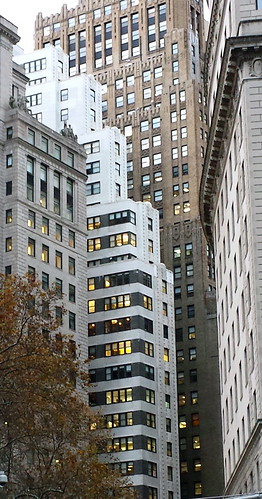
Like the Koppers Building, 29 Broadway in New York has a distinctive profile with wedding-cake setbacks. The Art Deco building’s symbolism proclaimed progress as well. However, by the time the designers and builders of 29 Broadway completed it in 1931, the economy had nosedived after the 1929 stock market crash. Still, the structure’s ambitious presence and its decoration celebrated what humans are capable of.
The first floor, particularly the vestibule and lobby, has a dazzling mix of marble and mosaics. The richness is notable, as with some other New York skyscrapers, coming at a time when so many people were down in economic prospects and when New York had been experiencing a slump in skyscraper construction. In fact, the commercial building provided solid employment to construction workers, some of whom subsequently earned an award for their craftsmanship from the New York Building Congress.
The setbacks of 29 Broadway provide a graceful break on Lower Broadway.
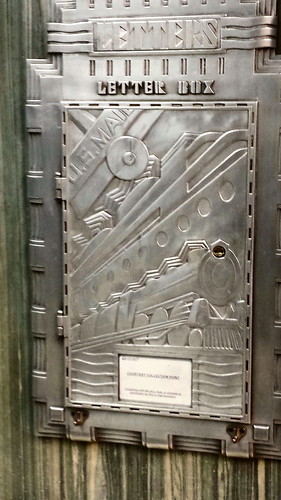
The letter box
The silver metalwork letter box on the first floor alone is award-worthy. It contains Art Deco symbols that panels exhibited throughout this period, which beckon to the human spirit to explore, conquer distances, and put faith in technology. The letter box shows an ocean liner, a locomotive, and an airplane, celebrating power, speed, and breaking new thresholds such as instrument flying and altitude records.
The 29 Broadway panel and the Koppers Building shields capture the sensibilities and the skills of a time period, much like the cave paintings of long ago or the decorative screens of today. They are living works of art, speaking not only to those alive then but to the subsequent generations fortunate enough to notice – and to appreciate them.
Part II: In Part II, Mindfulwalker.com examines more Art Deco panels – the entrance shields in a Lower Manhattan skyscraper that render transportation progress and travel to far-off places, and sculptural reliefs at a Hudson Valley school building that depict symbols of learning.
References and Further Exploration
“Art Deco in New York City,” Daniel Turkel, 2011.
Richard Striner and Melissa Blair, Washington and Baltimore Art Deco: A Design History of Neighboring Cities, 2014.
Art Deco Buildings
The beauty of Art Deco structures around the world, illustrated with David Thompson’s photographs
On Mindfulwalker.com


Since I’ve been reading your blog I hear architecture speaking to me. I find myself looking up at buildings all the time now, searching for details, instead of simply look for the entrance.
So I’ve walked by the Koppers Building a thousand times but never really looked at it. Time for a trip “dahntahn.”
Nita,
I’m thrilled if reading this blog has helped spark your looking up at buildings all the time, and I know just how observant you are. Great!
Well, guess who else had never looked closely enough at the Koppers Building, despite passing it on my travels or trips downtown various times? It was thanks to my very dear friend Monica.
This, of course, has only stoked my desire to explore this building more. The lobby and interior balconies sound like something else, with an incredible mix of marbles, brass mailboxes, and such.
As a loyal Pittsburgher, you’d appreciate the brief look at the Koppers Building in this blog post. Raymond Bowman, who is working in the architecture field in Pittsburgh, wrote it for his blog, rmb-design, after taking a walking tour using the Whirlwind Walk guidebook of the Pittsburgh History & Landmarks Foundation. Check out the photos of the letter box and the chandelier, as well a picture showing the view from the top of the building in 1958.
Enjoy your looking up!
Susan