Some musical riffs can suddenly elevate the mood. So, too, can a jazzy building. It can bring your senses alive, make you perk up and pay attention, if even for a short time. Buildings aren’t passive entities; the very good ones generate an active engagement. The best architects know this to the core. In a career cut short by death, Raymond Hood was a master at composing a sudden spark and riff with his buildings.
Such was my experience in walking westward on a street in Manhattan’s Upper East Side and finding 3 East 84th Street, a building that Hood and fellow American architect John Mead Howells designed. Suddenly, I felt my mood lift, and I uttered a little under-the-breath “wow!” The sight put a little pep in my step on a grayish afternoon. Before I knew it, I was engaging and closely looking at this Art Deco treasure. It sits on a block of quite-lovely buildings, on the north side of the street. Yet, without being garish, this apartment house stood out and was somehow brighter in its energy.
As I consider the work of Hood and Howells, I’m guessing that my response would bring them some pleasure. Whether it was their dramatic Daily News Building or Hood’s and André Fouilhoux’s black-with-gold-crowns American Radiator Building (both on 42nd Street), these architects obviously wanted people to engage with their structures, much like a musician creating experiences. The German writer and artist Johann Wolfgang von Goethe observed that “architecture is frozen music” – the tone of mind that architecture produces “approaches the effect of music.” This 1920s apartment house personifies this experience, in its sleek vertical lines and its zigzag, playful, and simple yet rich ornamentation. Like listening to a lilting flow of jazz, seeing the building’s decorative flashes feels like sensing that someone went a little wild for a moment but all the while maintained a natural sense of order. The effect can be hypnotic and mesmerizing.
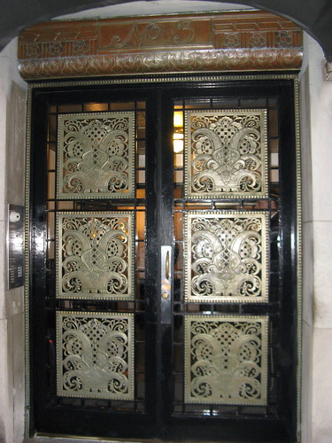
The front entrance
This building proves that New York’s Roaring Twenties spirit isn’t just in its large landmarks like the Chrysler Building. In this nine-story residence built in 1928, the architects designed a place that broke with traditional apartment houses at the time. It also foreshadowed the storied Daily News Building on East 42nd Street that came a year later. That we can see 3 East 84th Street in fine shape today – and enjoy its step back to an era of flappers, flourish, elegance, and go-for-it spending – is thanks to those in recent years who have been taking care of it.
Soaring Fame
For Hood, the 1920s was a time of major accomplishments, big commissions, and a sudden rise to international fame. Born in 1881, he had worked as an architect in relative obscurity until he and colleague Howells won a design competition in 1922 for their neo-Gothic Tribune Tower in Chicago. Hood was in his 40s and major success hadn’t come easily. After the Tribune contest, however, Hood’s architecture – each building very distinct and splashy – would draw attention and spark controversy. He and Howells, the son of author William Dean Howells, left New York with some of its most striking Art Deco structures.
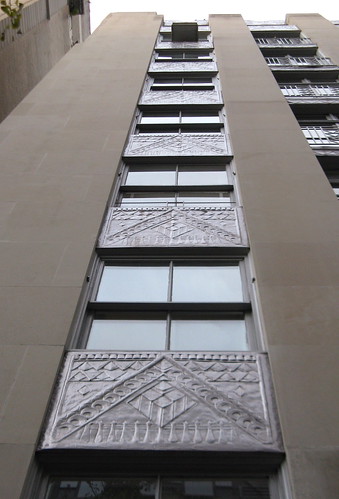
A view of 3 East 84th Street from across the street shows a profusion of Art Deco panels and spandrels, and strong vertical lines.
This apartment building commission came out of that Chicago and newspapering connection. Joseph Medill Patterson, whose grandfather had bought the Chicago Tribune when it was a weak, financially troubled newspaper and built it up, was one of two family members who took over the Tribune. After continued success with the Tribune, Patterson started a tabloid in 1919 in New York, the Daily News (first called the Illustrated Daily News). With a tabloid-rich news diet emphasizing scandals, crime, and celebrity happenings, accompanied by plenty of photos, the paper grew to have a circulation of more than 1 million readers by the mid-1920s. Patterson came to the East to be closer to the operation and decided to build an apartment house, with a large pied-à-terre that he would have on the top floor.
Sensationalized news built Patterson’s wealth. His wealth, in turn, supported sensational Art Deco beauty in an apartment house that lasted beyond his lifetime. Hood and Howells designed a building with a limestone face, intricately detailed decoration, and sweeping vertical lines. (Stand in front of the building and you can literally feel your eyes pulled upward.) This dwelling veered from the standard apartment houses of the day: Its vertical sweep contrasted with the primarily palazzo-style apartment houses in the area, with their horizontal lines and bulkier feel, inspired by the Italian Renaissance, as architectural historian Andrew Dolkart noted in a guidebook of Upper East Side walks.
Indeed, the building looked more forward than backward, as evident in its incredible, dazzling Art Deco ornamentation – zigzag lines, geometric shapes, and foliage patterns. Like the vertical lines, these choices were path-breaking for a residential building then, especially a luxury one, wrote Christopher Gray in a New York Times “Streetscapes” column. Gray called the building “a jazz-modern riff of smooth limestone and zigzag ornament” – very much the mood it conjured up when I first saw it. Its panels, of exquisite German nickel, are riveting, with an array of circles, triangles, lighthouse-like shapes, rings, and notches. Look at the rectangular panels one time and they appear simply to be playful, repeating geometric shapes, and look again and see faces.
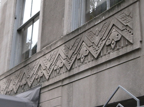
The frieze above the front entrance
The ornament elsewhere is similarly lively. The frieze above the entrance has an eye-entrancing effect, with a meticulous triangular motif in which one can view faces. (Gray observed, “is (the limestone frieze) abstract, or is it a pattern of chubby birds over faces with stylized hair?”) The flowing foliage on the doorway is stunning.
Jewel-Like Sparkle
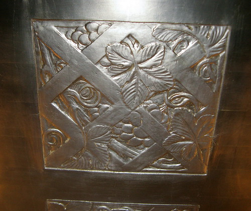
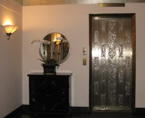
The lobbies of today’s luxury apartment buildings tend to have a sparse, cool, minimalist feel. Not so for this lobby. It had no pretensions to cool and intended to wow with flourish. The ceiling is a succession of large and captivating inlaid silver leaf squares of vines, leaves, and berries in a braid pattern. (Because I can’t stop staring at it, I have a hard time keeping my mind on a conversation while standing in the lobby.) The elevator door, with its many curving and shiny abstract patterns, is as beautiful as any in more famous Art Deco skyscrapers.
One of the ceiling’s beautiful silver leaf squares
The elegant lobby, with its eye-catching elevator door
Too often, the public considers works of art as something within museums or as designated pieces in other public spaces. Yet, these architectural features — panels, railings, doorways, and ceiling squares – are every bit works of art. It’s easy for people to walk right on by or through a space, and not give them a thought. However, their survival and maintenance depend on investment and work by individuals through the years who carefully tend them. The building, an apartment co-op since 1947, underwent extensive repairs in 1995. It is part of the Metropolitan Museum Historic District.
Fortunately, that sense of stewardship has held up in recent years. Today, the superintendent who takes care of the co-op building, Eddie Rivera, talks of its Art Deco detailing as if the structure is his own. At one point, someone had decided to coat the lobby ceiling, for example, with a terrible dark yellow paint. Rivera said he worked with the co-op board to find a contractor who would strip and clean the ceiling to restore its original appearance and luster, which involved workers cleaning the panels by hand around the foliage elements.
Such care keeps the art of this building intact and means its frozen music can play on. Hood was apt to play down the premise that his architecture was artistic. Talking of utility and function in a 1931 New York Times magazine article, Hood said that “the collaborators are the architects, the engineer, and the plumber” more than a sculptor and artist. Yet, this lesser-known Art Deco gem shows how Hood’s and Howells’ experimentation with forms and shapes resulted in a memorable effect.
Not very long afterward, in August, 1934, Hood died from complications of rheumatoid arthritis and heart problems, his career and life cut short at age 53. A day after Hood’s death, a New York Times editorial stated that Hood’s ability to zig into traditionalism first (as in the Tribune Tower) and then zag into modernism had drawn a number of detractors in opposing camps who sought architectural purity. “But,” the Times observed, “Hood always combined his openness to new ideas with a sure esthetic sense that protected even his most daring designs from the charge of freakishness. His monuments are all about us, and each one of them arrests the eye.”
A walk past 3 East 84th Street shows that seven decades later this is truer than ever.
View the slide show larger in Flickr.





Very nice article on a great looking building Susan. I love the frieze above the entrance and the lobby looks very cool and classy.
David,
I’m so delighted that you enjoyed the article and thought well of it. You are the expert in the Art Deco universe, in my book, and I was eager for you to see this post. Yes, the lobby had a very classy feel. I’m very glad that the ceiling was rescued from a mustard-yellow coating!
Thanks…made my evening.
Susan
Susan,
I love this article and the photos are terrific. I can’t help but wonder what the apartments looked like in the early years of this building.
Shelley,
Thank you for your great response! Happy that you enjoyed the article and the pics.
That is an excellent question about the interior of the apartments in the early years. When I see the super again, I will ask him if he knows anything about that, or I can dig around in some historical sources to see what I find out. Judging from what I see of the public spaces, I bet they were (and are) something!
Susan
I’m fascinated by those panels, Susan! Any info on who did the actual fabrication of them, the process used, and where (i.e., in NYC?) they were done?
Yes, those panels are awesome and beautiful, aren’t they, Gretchen? I came across some info on them. However, because the property doesn’t have its own Landmarks Preservation Commission report, for instance — it is part of the Metropolitan Museum Historic District — that document did not go into as much detail as I would have liked. I think it’s a good angle for a follow-up piece at some point, on one of the actual companies/people doing this and combine a few buildings to take a look at this.
I sensed from what I came across that Hood and Howells had someone in particular with whom they worked for a number of buildings, but that was as far as my investigating went for now.
Thanks for a great question! It should be fairly easy to dig up the info.
Susan
Great piece. The decorative motifs in the friezes look Masonic to me. Could that be?
Great question. I’ll do some research to answer that one. Thanks so much, Courtney! Will let you know if/when I find an answer.
Love the questions!
Wow, what a gem!
I’m going to have to visit in person some time.
Great that you were able to get inside.
Good photos and, as usual, an excellent discussion.
Thank you very much, Moshe. The super takes a lot of pride in this building, and he was quite gracious. He also told me that French tourists come here to look at this building, which I found interesting. Yes, I felt fortunate to be able to take my time examining and seeking to capture the beauty of the lobby.
I feel we’re fortunate this building is still here. If you take a look, enjoy!
Gratefully,
Susan
I have been browsing online more than three hours these days, yet I never found any interesting article like yours. It is beautiful, worth enough for me. Personally, if all site
owners and bloggers made just the right content as you did, the Internet will probably be a lot more useful than ever before.