Buildings are like stories, marked by scenery, time and place, and plot. They often have a rise and decline, and maybe a rise again. Buildings evoke an era, and characters conceive, design, build, and inhabit them. Like the times when we read only a few pages or a chapter of a story, we may see and appreciate much just by looking at a part of a building.
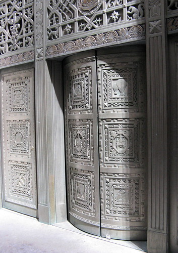
I’ve walked many times by a single entrance and a set of doors on Hanover Street in Downtown Manhattan, hurrying by, noticing the doors’ beauty, and making a mental note to dig into the story of the building. Hanover is a narrow, curving street from the days of Dutch settlement, with large skyscrapers hulking above that make it somewhat dark even on the sunniest days. When I stopped to look at the entrance, I noticed the fine details, fanciful images, and rich materials. On the door panels are trains, ships, hot air balloons, and other means of transport, while above them are many animal figures, carved abstract forms, and allegorical figures. What is it about this building entrance, and what do its images mean? Who designed them?
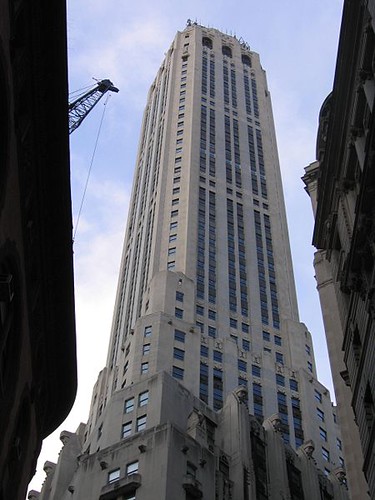
The building is 20 Exchange Place, named for its address on a narrow cross street to Hanover and now housing high-end rental apartments. Originally, this streamlined skyscraper, a New York City designated landmark, was the City Bank Farmers Trust Company Building, headquarters of the bank that today survives as Citibank. It has an odd, irregularly shaped base that conformed to the “this-way-and-that-way” diagonal streets of Exchange Place, and Hanover, Beaver, and William streets. From its odd shape the skyscraper dramatically rises, with setbacks, to a slender tower that is situated askew to the base so that it conforms to New York City’s north-south grid. It’s one of Lower Manhattan’s most distinctive skyscrapers, with quite a history.
Aiming To Be “The Tallest”
The well-known New York firm of Cross & Cross, two brothers, designed the skyscraper, and the company built it in 1930-31. The skyscraper’s planning and construction phase included fascinating challenges and obstacles, set in the midst of the boom-boom late 1920s when the sky seemed to be the limit. City Bank Farmers Trust Co. had grown out of a massive merger and was one of the new banking conglomerates of the era. While Wall Street had long drawn banks and exchanges since the early 19th century, in the early 20th century banks looked to build massive skyscraper headquarters in the area, City Bank Farmers Trust included.
Couple this with the frenzy by varied companies to build the world’s tallest building, a race in which City Bank Farmers Trust sought to compete. The bank staked its claim to the “world’s tallest” title when it filed building plans in October 1929, according to the New York City Landmarks Preservation Commission (LPC) landmark-designation report.
Then the stock market crashed that very month and a proposed merger with another large bank fell through afterward, changing the situation. City Bank Farmers Trust scaled back its plans and constructed a 59-story skyscraper of just above 685 feet. At the time of completion, it was the world’s tallest stone-faced building, the LPC notes, its steel frame clad in Mohegan granite at the base and Alabama Rookwood veined gray limestone on the tower.
Physical impediments played a role during the construction phase, too. The builders and engineers had to contend with parts of old foundations, quicksand, and water on the site. It is, however, solidly anchored in the earth, as the LPC report explains: “The excavation took the lower basement to 40 feet below water level, dug out of solid rock.”
The bank spared nothing when it came to the building’s exterior of stone and its interior lobbies of marble and ornate decoration, as directed by the architects. Its presence and ambitions as an international bank are symbolized by 11 coins of carved granite on the main entrance at 20 Exchange Place, each representing a different country in which the bank had offices.
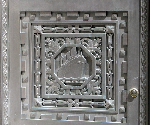
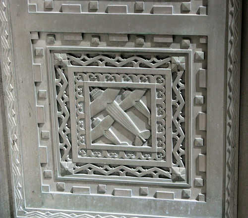
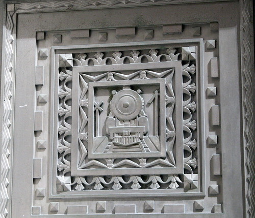
Yet it’s the lavish and solid decorative doors, like the ones I often pass on Hanover Street, that catch my eye most on this skyscraper. They are made of nickel silver, an unusual alloy, which the architects wanted to deploy to avoid colored metal. On one panel are the modes of historic transportation, from sailing ships to steam locomotives. On another panel are those of modern transportation, such as airplanes and ocean liners.
Boundless Horizons
British sculptor David Evans, who created much of the building’s ornament, captured the flavor of that age, in my view. Transatlantic flight and cruises across the world’s oceans spoke powerfully of the increasing power to travel to faraway places and engage in international commerce. The decade of the 1920s was the pioneering one for commercial flight. Suddenly, a world of greater possibility existed, freed from yesterday’s limits.
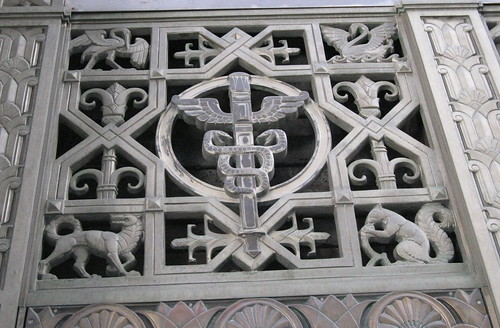
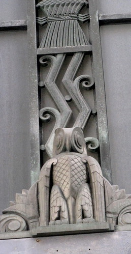
Seemed the banks, such as City Bank Farmers Trust, sought to place themselves at the center of this sense of possibility and prosperity, through their buildings’ iconography, but always balanced with the symbols of wisdom and prudence. (Pity that speculation during the era proved that many in the market disregarded those qualities.) Above the doors are nickel silver grilles with the scenes of transportation, punctuated with caducci, which are ancient Greek symbols of commerce. Owls, the symbol of wisdom, are perched above.
This carved grille has a caduceus, historically a symbol of commerce.
An owl watches from above.
When the building opened, the Hanover Street doorway served as the entrance for a branch office of the Canadian Bank of Commerce, a building tenant. The entrance appears to no longer be in use, far different than when many streamed through the doors during the years as a bank. Today, a doorway full of trains, ships, and planes carries the imagination back to an earlier time of fanatical optimism and tumult around Wall Street.
Here are additional views of the details at 20 Exchange Place, followed by a slide show.
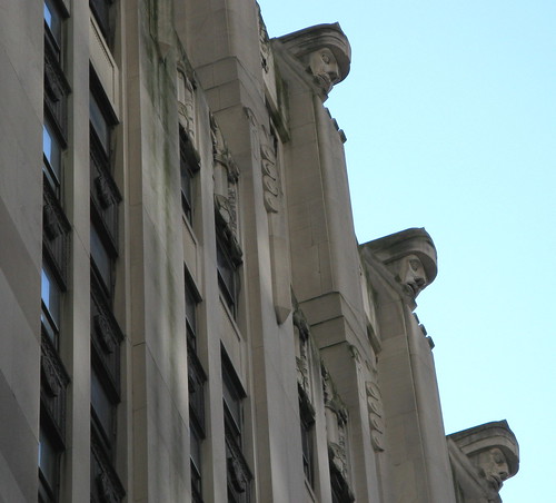
These figures, representing the “giants of finance,” look down at the street from a setback at the 19th floor.
View the slide show larger in Flickr.


Great piece, Susan. I remember those doors from a visit to NYC. They are so representative of their time when the history and advances in transport technology were celebrated in such a public and long-lasting way.
David,
Many thanks! I know from your work and your blog how you appreciate such art and features. So your own work has inspired me.
A question for you: Would you call the way the owl is rendered (shown in the photo) Art Deco? Others call this building “modern classic” as to style though it has various Art Deco elements.
You capture it well when you say “long-lasting” about those celebratory panels. Thank goodness the landmark designation means they will be here for generations to come.
All the best,
Susan
Thanks, Susan.
I don’t know what they mean by “modern classic” – to me it doesn’t really convey anything about the style of the building, just that has a quality about it.
I would call the owl Art Deco. It is more stylised that realistic, which is an Art Deco trait. I especially like the solid disks making up the eyes. The zigzag decoration behind, but for the curl of the leaves, is straight from the Art Deco style-guide.
Elsewhere on the doors, the angle of the ship and the zigzag wave representing the sea are very Art Deco, and I also like the presentation of the three aeroplanes, which could be from any number of graphic posters from the deco period.
The figures on the facade at the ‘first step’ of the skyscraper remind me of the ones along the roofline of the former Toronto Hydro-Electric Building from around the same time by architects Chapman & Oxley with associate Albert E. Salisbury.
Susan,
So I have to come here to learn that the caduceus is the symbol of commerce and NOT medicine? I looked it up and learned that the medical profession (perhaps) mistakenly took the caduceus instead of the Rod of Asclepius (a similar figure) and has been bestowing it upon its physicians since the late 19th century. I wonder if my doctor bosses know this?
Thanks for the “trivia”. Your website is enlightening in too many ways!
Hi, David,
That’s my sense about the “Modern Classic” term, too — what does it really mean? Who knows?
Definite resemblance of the figures on the setback of 20 Exchange Place with the Toronto building. These NYC figures, on the 19th floor setback, are based on Greek and Assyrian sources, from what I’ve read. It’s such a funny, even weird experience, to be focused at street level while walking on Hanover and Exchange Place and then look up to suddenly see these eyes staring down. Whew.
My sense is that 20 Exchange Place has definite Art Deco elements, and you’ve filled in the info and provided a fuller sense of that for me.
It’s helpful to find out more about the sources for this ornamentation, too. I did not find much on sculptor David Evans, a Brit.
I always love those zigzag waves!
Susan
Nita,
Well, that is quite a way of being “enlightening!” Let me know what your bosses say. Now I’ve learned something about Asclepius, a practitioner of medicine in Greek mythology.
I’ll be eager to find out what they say. The doctors have a lot of company in doing this, since many in the medical profession have mistakenly taken the caduceus. Who knew?
I found a blog post that captures this confusion about the two symbols. Sounds like you beat me to the homework already, but you may like to read this one, too.
Hippocrates was a worshiper of Asclepius, apparently.
Glad you enjoyed the post, and you’ve added more for me to think about! I find it fascinating how the designers of buildings employ these symbols and motifs, and their various meanings. They say much about the values they are promoting at the time of design and building.
(Now I need to read up more on the caduceus, too…is it a symbol of wisdom in business matters at all?)
Enjoy your day, and thanks for your comment!
Susan
My dad used to work at 20 Exchange Place when it was the Canadian Imperial Bank of Commerce (1960-1994). I used to go with him when I was in elementary school (1960’s and 70’s) once a year and always remembered those doors. I loved looking at them and now love that I am able to show my children the same. I live in California now and I want to thank you for bringing my childhood back for a few minutes and make me smile. I also used to go to the 52nd floor and look out and think I was on top of the world. We also were able to watch the Twin Towers being built when I was up there. I loved the bank lobby also; the architecture was magnificent.
Cynthia,
What a fabulous and wonderful memory. Thanks for sharing it here, with readers. I feel like I can picture it, especially the wonder of such a sight as a child would encounter it (those doors!). How great that you can now show it to your children!
I grew up in Western PA., and while it was a wonderful childhood I was never up as high as the 52nd floor of a skyscraper then. You are right — “on top of the world.”
How lucky to have been able to experience this building while your father worked there. I believe that’s a key reason why these places mean so much to us — they become not only beautiful physical places but a part of our hearts and memories.
Again, thanks!
Susan
Inspirational building, absolute gem.
Thank you for the wonderful guide to 20 Exchange. I’ve been subletting an apartment there and am fascinated by the design.
If interested, I would be glad to share a few additional interior shots and eye-level photos taken from the setback floor (now a lounge and gym for the apartments) showing those dramatic figures up close. Each one has a different expression on its face, reputedly depicting the varied emotions experienced by the traders of Depression-era Wall Street.
Cheers,
W
Hi, Walter,
Thanks so much for your gracious response to the article and guide on 20 Exchange Place. I go by this building often and appreciate it each time. How great that you sublet there.
I’d possibly be interested in a follow-up piece highlighting the additional interior photos. That would give people a closer look at these very expressive figures. I will follow up with an e-mail.
Glad you enjoyed the Mindful Walker article!
Cheers,
Susan